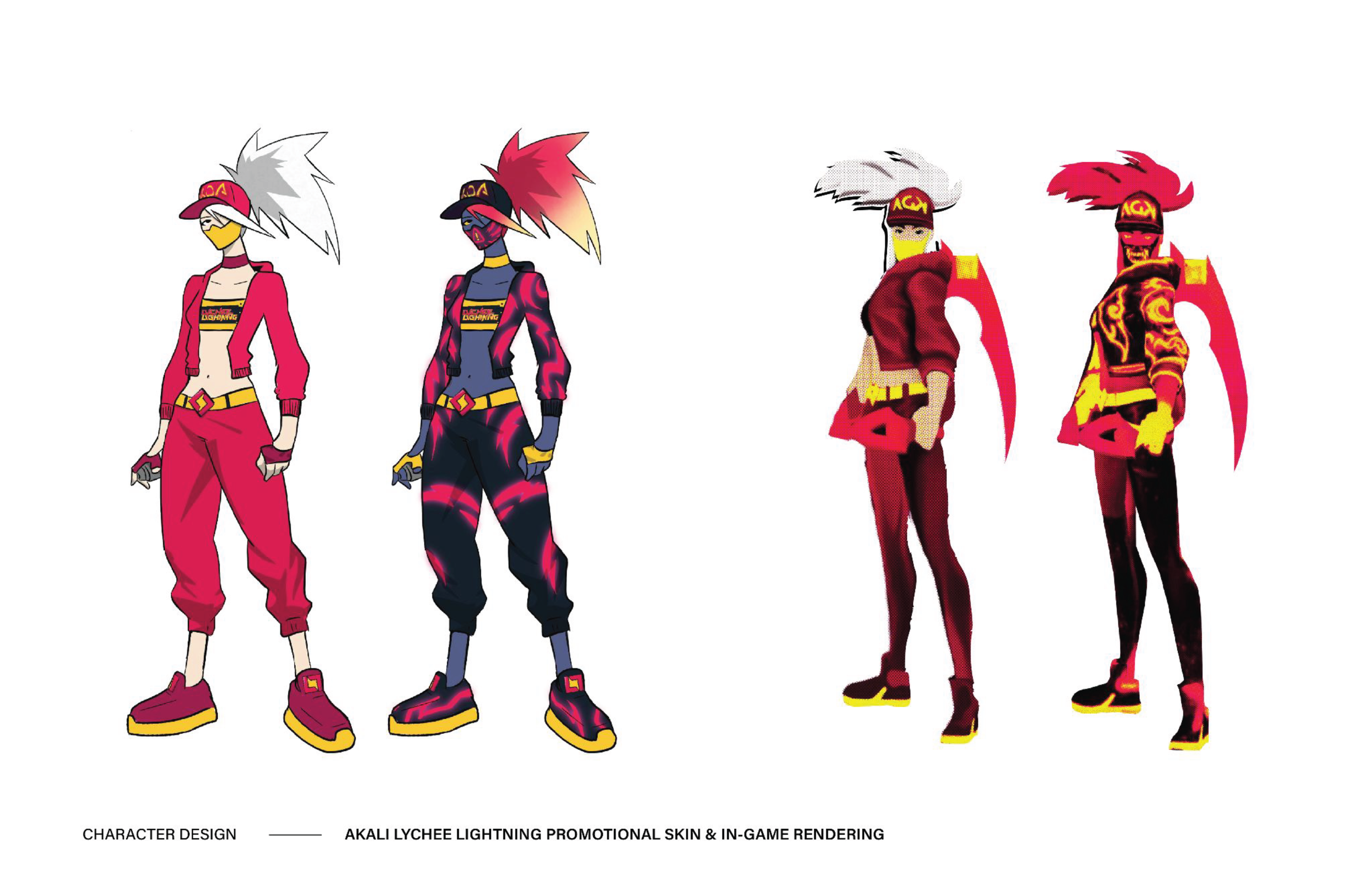
MTN DEW:
Lychee Lightning
Atlanta, GA
2021
Myself along with 9 other designers were tasked by the creative team at PepsiCo to develop a new flavor concept and visual identity for Mountain Dew. The goal was to expand the brand’s flavor portfolio with a bold new product that would resonate with young adults while staying true to Mountain Dew’s high-energy brand DNA.
-
Mountain Dew needed to introduce a new flavor that would stand out in an increasingly competitive beverage market while appealing to a core audience of 18–25-year-olds. The challenge was to create a product concept and visual identity that felt fresh and exciting without straying from Mountain Dew’s recognizable, rebellious personality. This new flavor also needed to command attention on crowded retail shelves and feel cohesive within the existing Mountain Dew brand system.
-
To ground our design decisions, we focused on understanding both the brand and its audience:
Brand analysis: Studied Mountain Dew’s existing flavor identities, typography, color systems, and tone to identify what elements could be pushed and what needed to remain consistent
Audience research: Examined trends in youth culture, flavor experimentation, and visual preferences among young adult consumers
Competitive analysis: Reviewed competitor beverage packaging to understand how bold typography, color, and imagery are used to capture attention on shelf
Concept exploration: Conducted rapid sketching and typographic experimentation to test how far the brand could be stretched while remaining recognizable
-
My approach focused on creating a visual identity that emphasized energy, motion, and intensity while highlighting the uniqueness of the lychee flavor.
Designed a custom wordmark with sharp angles and slanted forms to convey movement and energy
Used interlocking letterforms to create a sense of cohesion and visual impact
Developed multiple logo variations to ensure flexibility across packaging and marketing applications
Created a custom lettermark where two interlocking “L”s form a lightning bolt, reinforcing the flavor name and Mountain Dew’s high-voltage personality
The final identity delivers a bold, shelf-ready presence that feels both experimental and unmistakably Mountain Dew.


With the Lychee Lightning logo, our goal was to create something bold and vibrant that captured the excitement of this new flavor—while still feeling distinctly Mountain Dew. We needed it to stand out on the shelf but stay rooted in the brand’s rebellious identity.
The result: a custom wordmark featuring sharp angles, slanted terminals, and interlocking letterforms that reflect the energy of both Lychee Lightning and the Dew brand. Versatility was key, so we developed multiple variations, including simplified wordmarks, alternate shading, and a unique lettermark where two interlocked “L”s form a lightning bolt.